You can choose clothing colours by deciding what you enjoy wearing and checking the actual combination in ordinary use. A season label can be convenient shorthand for a style you like, but it need not decide which clothes you are allowed to keep. The useful outcome is a wearable outfit you prefer, rather than a permanent verdict about your face or skin.
Lighting, fabric and photographs can complicate comparisons. Two garments may look like a match in one light and less alike in another. A camera’s white balance or a later edit can also change the appearance of a photograph. These are different problems, and neither supplies an objective test of which colour makes a person more attractive.
This guide offers a modest wardrobe exercise using clothes you already have. Its technical sources explain colour matching and photographic adjustments. They do not test personal colour-analysis systems or validate a method for assigning people to seasons.
Who this is for
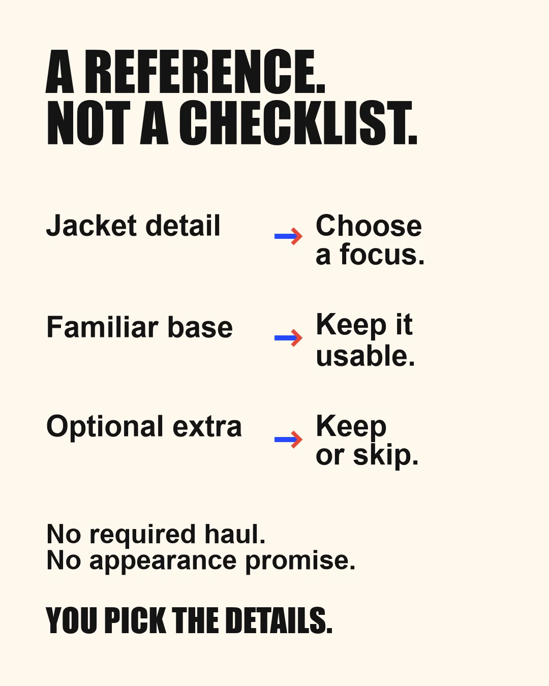
Use this approach if you want to choose between tops, combine existing clothes or describe a preferred look more clearly. You might like closely related colours, a noticeable light-dark difference, an accent against a quieter outfit, or several different approaches on different days. Those preferences do not need to resolve into one correct category.
The starting point is your own purpose: a shirt you enjoy near your face, a combination suitable for work, or an outfit whose pieces are easy to use together. There is no requirement to make your complexion look lighter, darker, younger or different. Visible variation in skin appearance is not a defect for this exercise to correct. A wardrobe photograph cannot diagnose a skin condition or health problem. This guide does not assign an undertone from a mirror or image.
You can also decide that colour is not the main issue. A garment’s fit, texture, care needs or comfort may matter more. If you like the colour but rarely wear the item, investigate that practical reason before buying its supposed replacement. A preferred palette is useful only if it helps you dress for your life.
Before you start
Separate a physical match from a photograph
The International Commission on Illumination’s vocabulary defines metamerism in terms of different spectral stimuli producing the same tristimulus values within a specified colour system. In practical textile discussion, X-Rite describes items that look matched under one light but different under another. You need not measure fabric spectra to make an ordinary wardrobe choice. The useful lesson is that a match observed in one setting does not settle how two real garments look everywhere. CIE vocabulary entry, X-Rite textile example.
Do not call every apparent colour difference metamerism. An image can differ because of lighting, camera settings, editing or display conditions, without establishing anything about the fabrics’ spectral relationship. An unevenly lit mirror is also a poor basis for a precise technical conclusion. For this exercise, describing what you see is enough: the trousers and jacket look close together in this room, but the difference is more noticeable by the window.
Nikon’s practical white-balance guide explains that lighting and white-balance choices affect a camera image. Adobe’s Lightroom Classic documentation describes temperature and tint controls that alter a photograph’s appearance. These sources support treating photos as records with conditions, rather than exact colour samples. They do not imply that one setting guarantees a faithful representation in every scene. Nikon white-balance guidance, Adobe tone and colour documentation.
Set one ordinary goal
Choose a small question before opening the wardrobe. For example: “Which of these two tops do I prefer with the trousers I wear to work?” That is easier to answer than “What colours should I wear forever?” Choose items you can reasonably compare and a setting relevant to their use. You do not need a full set of colour drapes, a new camera, editing software or a shopping appointment.
If you already use a season name, treat it as vocabulary for an idea you want to try. Translate it into observable choices such as a muted green top, a darker jacket or a stronger contrast between two pieces. The four technical documents used here do not establish whether a season system reliably classifies people. Equally, that limited evidence is not a study proving that every styling system is false. Your ability to enjoy a colour does not depend on resolving that larger claim.
Actions in order
1. Start with an existing combination
Pick an outfit that is usable apart from the specific choice you are making. Keep its other pieces in place while changing the top, scarf or other single item under consideration. This makes it easier to describe your preference without also changing fit, silhouette and accessories. It is a practical comparison rule for this exercise, not a validated colour-analysis protocol.
Look at the whole outfit from an ordinary viewing position. Ask whether you enjoy the combination and whether it serves its purpose. Avoid zooming into tiny areas of skin to find a supposed flaw. If both options work, record both as usable. A decision does not become better because one option is declared unsuitable for your body.
2. Describe contrast within the outfit
Use ordinary descriptions: a pale top against dark trousers, two similar dark pieces, a bright accent beside a quieter jacket, or a repeated colour in different items. Here, contrast means the difference you choose to notice between pieces. It is not a numerical target derived from your eyes, hair or skin.
Decide what you want that difference to do. Perhaps you like a clearly visible shirt beneath a jacket, or prefer the pieces to sit more quietly together. Try the alternative already available to you. This exercise does not assign an outfit contrast level from a person’s features, and it offers no attractiveness score or ideal face-to-clothing ratio.
3. Check the actual clothes where they will be worn
If a near-match matters, look at the pieces together in the ordinary lighting you are likely to encounter. A jacket and trousers that seem almost identical at home may look more distinct elsewhere. You can accept that difference, choose a deliberately contrasting combination or investigate another existing item. None of those decisions requires you to identify the scientific mechanism.
Keep the question bounded. You do not have to chase every possible light source or find a match that survives all environments. X-Rite’s article discusses industrial colour control and markets specialist equipment; its manufacturing context is not a requirement for a personal wardrobe. For an ordinary outfit, the relevant issue is whether the combination works for the situations that matter to you.
4. Use photographs only if they help
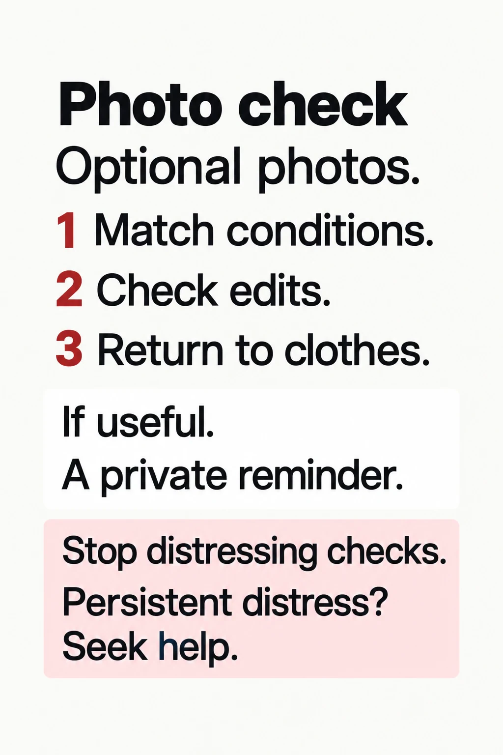
You can make the choice in person. If you prefer a private reference photo, keep light, position, distance, camera settings and preparation reasonably similar between comparisons. Avoid applying a different filter or colour edit to one option and then attributing the result to the clothing. Automatic settings may still vary; similar conditions reduce one source of confusion without turning the pictures into laboratory measurements.
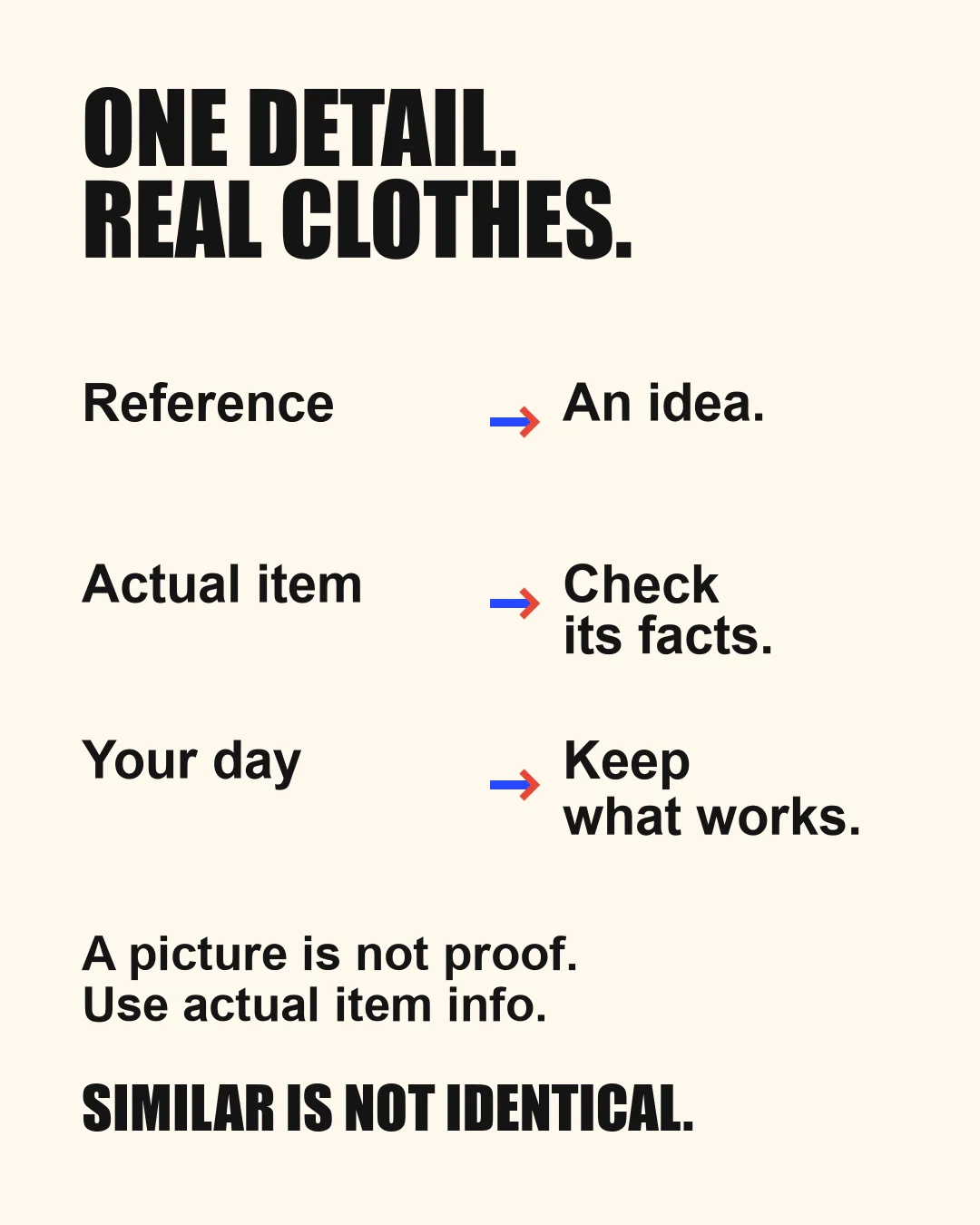
A phone screen or online listing is not a promise about a garment’s colour in your room. If a purchase would depend on a very close match, consider viewing the actual item and checking the seller’s current return conditions before committing. Do not edit your skin to make an outfit appear successful. A photo can remind you which combination you liked; it cannot establish a medical undertone or a general attractiveness benefit.
5. Keep the decision reversible
Wear the preferred existing combination when practical, or put it aside for an ordinary opportunity to try it. Notice whether you still like it while getting on with your day. You can change your mind without replacing the rest of your wardrobe. Keep a short note only if it saves effort later: “Green shirt with these trousers; prefer the darker jacket.”
If you want a new item, identify the gap first. Is another colour actually needed, or does an existing piece already do the job? Obtain the current price, care requirements and relevant purchase conditions for the specific item. A palette label is not an instruction to discard serviceable clothes or to buy a coordinated set.
Costs, risks and stop criteria
Using clothes you own can involve no purchase. That does not mean every person has no time, access or practical constraints. A new item, tailoring or a paid styling service brings its own actual charges and conditions. This guide supplies no universal cost range, required session length, review frequency or promise of money saved. You can stop after one useful decision.
The most immediate practical risk is overinterpreting a small comparison. Different light, fabric position, camera processing or editing may change what you see. If the options are hard to distinguish, “either is fine” is a legitimate result. You do not need to resolve uncertainty by purchasing equipment or checking yourself repeatedly.
| Situation | A useful response | Stop point |
|---|---|---|
| Two pieces match in one room but differ elsewhere | Decide whether the difference matters in use | No need to identify a perfect universal match |
| Two photos give conflicting impressions | Return to the actual clothes or accept uncertainty | Do not infer a fixed body category from the discrepancy |
| You enjoy a colour outside a named palette | Keep it as an available preference | A label does not require replacing it |
| Repeated checking makes dressing harder | End the exercise and use a comfortable familiar outfit | No additional appearance test is needed |
| A seller proposes a whole new wardrobe | Ask what concrete need each item addresses | Decline purchases without a clear use and acceptable cost |
Stop if the exercise becomes a loop of close inspection, dissatisfaction or pressure to correct normal appearance. Leave the comparison and return to ordinary clothing choices. If appearance distress is persistent or interferes with daily life, a qualified healthcare professional can help with that concern; a palette assignment is not treatment. This guide offers no diagnostic screening or clinical intervention.
The CIE entry is a technical definition. Nikon, Adobe and X-Rite provide guidance while operating in commercial photography, software or colour-management markets. Their documents are not independent trials of styling outcomes. This article has no affiliate links, paid product placement or product ranking, and it does not claim a personal device test, professional colour consultation or clinical review.
Myth or Real?

Claim
Social paraphrase: Camera settings and edits can alter the colours shown in a photo.
Verdict
REAL
Facts
White balance and colour controls can change recorded appearance; a screen image is not an exact sample of physical clothing.
Commercial technical guidance supports possible image changes, not personal season categories or a guarantee of faithful colour.
An archived question reports automatic white balance and filters, then asks whether software correction would solve the problem. The post already recognises image processing; no universal false belief or verified personal result is attributed to it. Nikon describes white-balance choices and Adobe describes Temperature and Tint controls. These commercial technical documents support possible changes in a photo, not exact physical colour recovery, reliable season classification or a clinical result. The selected reply is discussion only, not an approved correction protocol. Source images and user photographs were not inspected. Keep any private photos reasonably comparable if useful, but automatic processing and display differences may remain. Return to actual existing clothes, keep either option or accept uncertainty; no camera, editing software, drapes or new wardrobe is required. Do not edit skin to make an outfit appear successful. A short reminder is optional and untested, not a permanent body category. Stop repetitive close checking or pressure to correct normal appearance. Persistent interfering distress needs suitable qualified healthcare, not a palette assignment. Two primary documents reuse the main four-publisher set; the social question adds no factual authority or fresh demand.
Takeaway
Keep photos optional; return to actual clothes, your preference or uncertainty, and stop distressing checking.
Sources
Claim discussion: Archived r/coloranalysis: Software to correct photos?.
Evidence: Nikon: Setting White Balance; Adobe Lightroom Classic: Image tone and color.
Checked 2026-10-20. Scope: Ordinary optional clothing choices, not camera calibration, metamerism measurement, skin diagnosis, ideal palettes, attractiveness scoring or styling efficacy.
How to assess the result
Consider this invented decision note, which illustrates the process rather than reporting a customer result. Someone wants to choose a work outfit from a navy jacket, dark trousers and two existing tops. The jacket and trousers look closely matched at home but more distinct under the lights where the outfit will be worn. They prefer treating the pieces as two different colours rather than searching for an exact match, and choose the lighter top because they like the visible difference within the outfit.
Their first phone pictures appear inconsistent. On checking, one image has a warm filter and the other does not. They stop using those images to judge the clothes, return to the actual combination and keep a short note of the chosen pieces. They buy nothing and do not assign themselves a season or undertone. If the near-match had still bothered them, a different existing jacket or a decision to postpone the outfit would also have resolved the question. No physical colour measurement, improved appearance or psychological benefit is demonstrated by this example.
Ask whether the process answered the small question you started with. Can you put together the intended outfit, do you prefer its appearance in ordinary use, and are its fit and care demands acceptable? A useful result can be choosing one option, keeping two alternatives or deciding that colour was not the problem.
If you keep a note, describe the clothes and context rather than assigning a score to your body. “These two dark fabrics look different under the office lights, and I like them as separate colours” is more useful than declaring a failed personal category. It tells you what to wear next time without requiring the same lighting or photograph to be recreated exactly.
Your preference may change with an occasion, another garment or simply what you feel like wearing. Nothing in this exercise measures that preference as an improvement in health, social success or attractiveness. It has done its job when choosing clothes becomes a little more concrete and manageable, with room to keep enjoying colours you already like.


Sources
- CIE: metamerism. Technical vocabulary entry, December 2020; supports the scoped definition, not a clothing-season system.
- Nikon: setting white balance. Practical camera guidance; supports image-condition cautions, not precise physical colour measurement.
- Adobe: image tone and colour. Software documentation; supports temperature/tint editing distinctions, not a styling outcome.
- X-Rite: Black Friday and colour tolerances. Posted November 2020 and modified November 2025; commercial manufacturing discussion with a textile lighting example, not a wardrobe equipment requirement.
FAQ
Common questions
Must my preferences fit one season category?
Those preferences do not need to resolve into one correct category.
Must I buy special equipment?
You do not need a full set of colour drapes, a new camera, editing software or a shopping appointment.
Can either option be acceptable?
If the options are hard to distinguish, “either is fine” is a legitimate result.
Topic hubs
Tags